TECGEN
Trade Show + Brand activation
Disciplines
CONCEPT (TRADE SHOW)
ART DIRECTION
DESIGN (TRADE SHOW, PRINT, SOCIAL )
BRAND IDENTITY
There’s a growing wave of innovation in the firefighting and PPE sector, with more brands challenging outdated norms. No one, however, pushes the performance of lifesaving clothing like TECGEN.
Armed with proven claims, the strategy was straightforward: get firefighters into the gear and let them share their honest opinions, the most trusted currency in the industry.
Simple in theory, but at FDIC, the sector’s annual trade show mecca — execution was everything. TECGEN’s booth was small, isolated, and competing for attention in a highly saturated environment. Standing out required more than presence; it demanded participation.
With the right partner and a brave willingness to push beyond convention, the result was a bold activation that cut through the noise.


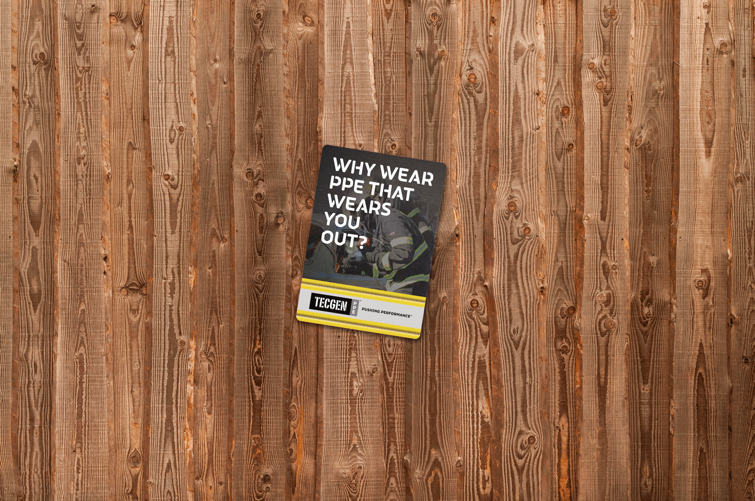

At the booth, visitors were challenged to suit-up with the fastest winning TECGEN turnout gear. The interactive cost-calculator let customers see the overall savings of TECGEN. And the multi-folding ‘Z-card’ brochure ensured that no one left empty-handed.
There were memorable reminders to visit the booth throughout the enormous tradeshow. Display cases invited attendees to shatter convention in high-traffic areas, bathrooms featured surprise ‘try-ons’ with engaging mirror clings, and the showbook hit home the unique message with an ad that only used 10% of its area.
FDIC was, of course, supported with the usual e-blasts, social, and web banners. This all amounted to some pretty impressive growth for the client and an Internationally recognized advertising award for our efforts.


The FR side of TECGEN also needed some innovation to help get their superior performance message across to the public. And with thousands entering the booming Oil and Gas industry questioning why FR couldn’t be comfortable and stylish the time was ripe.
FR’s brand expression mirrored that of PPE’s. With the same tech/stencil font from Fontsmith, the focus on engineered fabric (this time in navy blue to match workwear), and the clever TOV copywriting.
Retail was a big target, although once again tradeshows were the primary touchpoint. Outside shows stencils were laid that promoted the booth while actively displaying the unique wicking qualities of the workwear. PoS and other retail materials helped direct new recruits to the clothing while the ‘Z-card’ brochure educated and built brand advocates.