Optic Sky Rebrand
Client and friends Optic Sky were desperately in need of a brand identity that not only supported their stature but pushed them into their next evolution. They needed a mark and positioning that fit the production landscape, and with a focus on west coast tech clients.
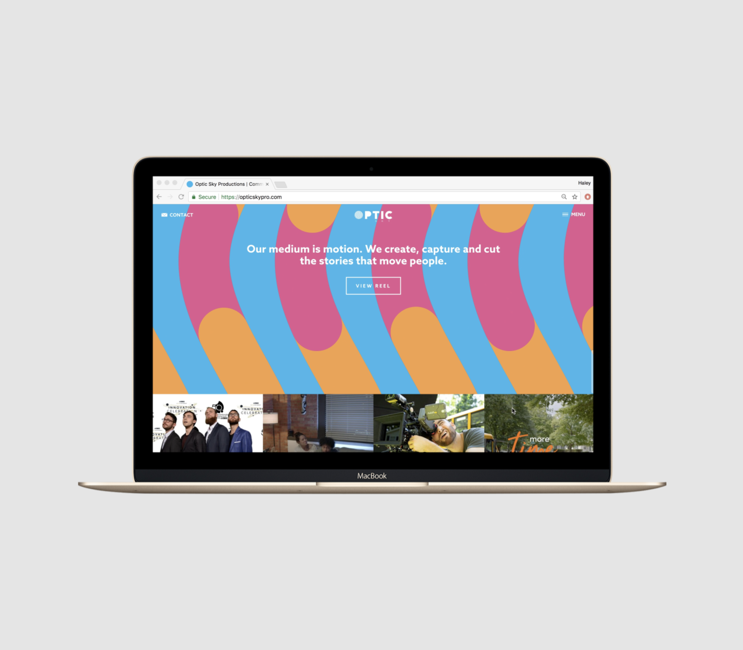
With the world of production morphing continually it was critical that the brand identity support the versatility of our digital age. while communicating a solidity and longevity that a young company may otherwise find hard to express.
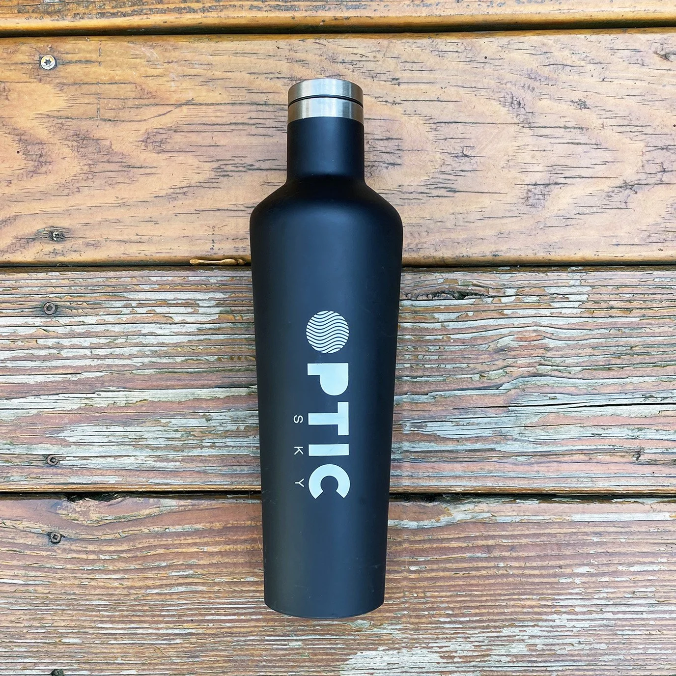
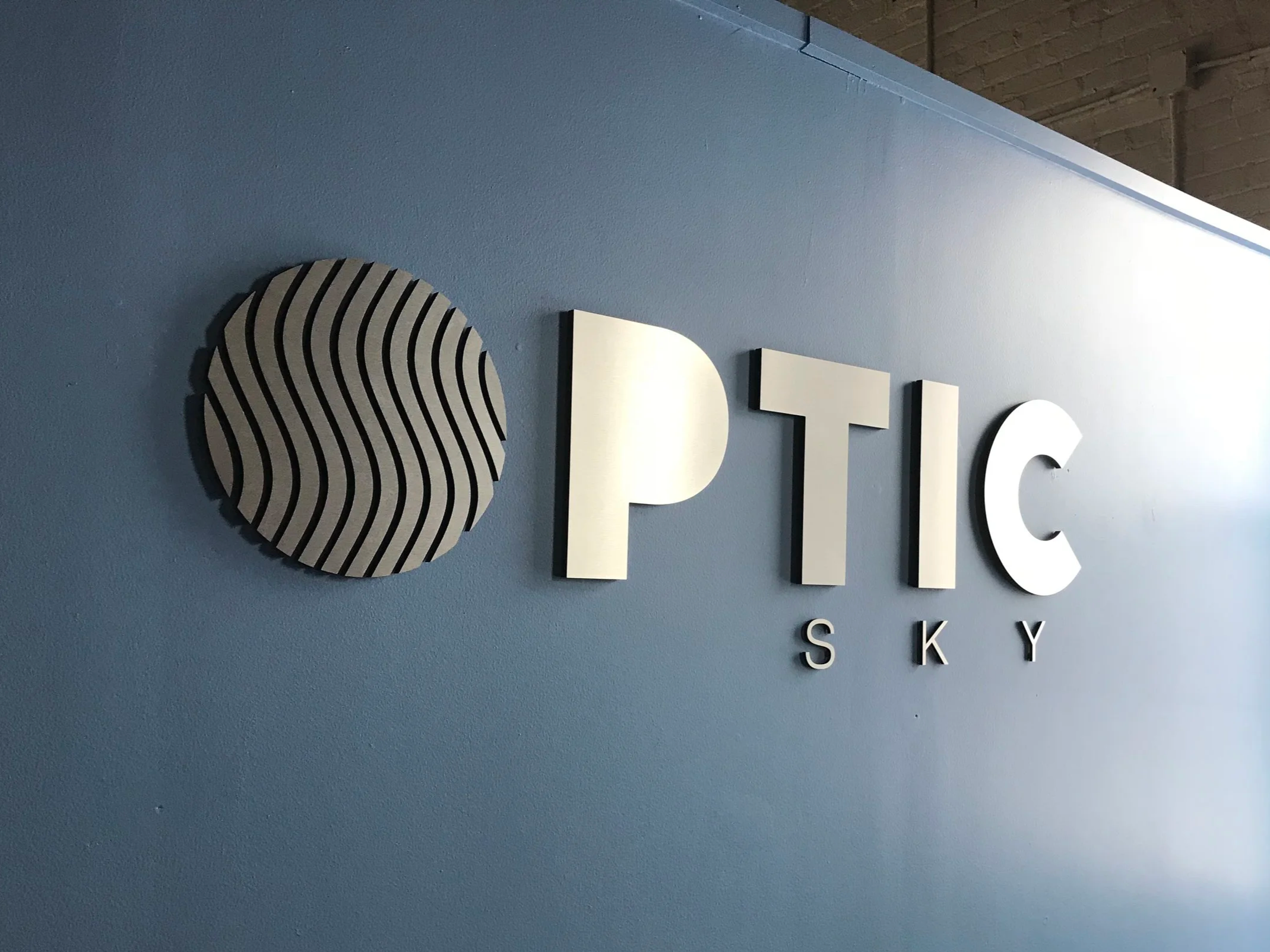
With animation being a key function of their business, crafting a mark that opened up creative opportunities by becoming a canvas that intimates at motion, and illusion was a an exciting territory.
Fresh and modern yet rooted in the classical. The identity is anchored by an optical illusion, conveying energy and motion even when static. The mark also serves as a versatile icon, used independently as a motion asset, social avatar, or however the creative team chooses.
“You can talk design principles all day long when doing a rebrand, but at the end of the day, it’s a visceral gut choice. It feels right and captures the true energy of your company vision. When we saw the logo, this truly captured who we are as a creative company.” — Aaron Gordon, Founder, Optic Sky Productions