ITT i-Alert Rebranding
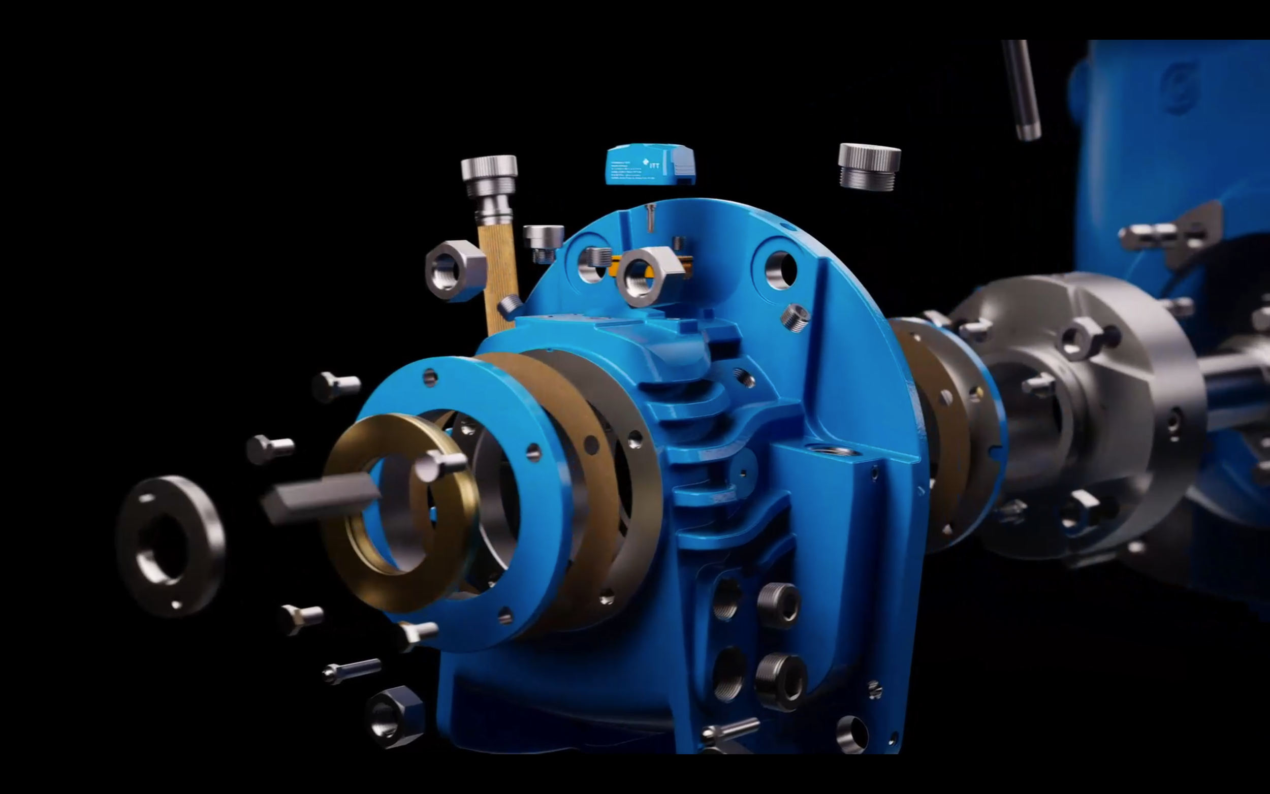
Some rebrands chase headlines, this one helped sell an entire business line. The ITT i-ALERT platform shifted from monitoring to intelligence, transforming machine data into secure, actionable insight. The system can act on continual input, such as vibration, to order parts that it determines will break weeks in advance, so rather than days of downtime and lost productivity the line manager can be ahead of “situations”.
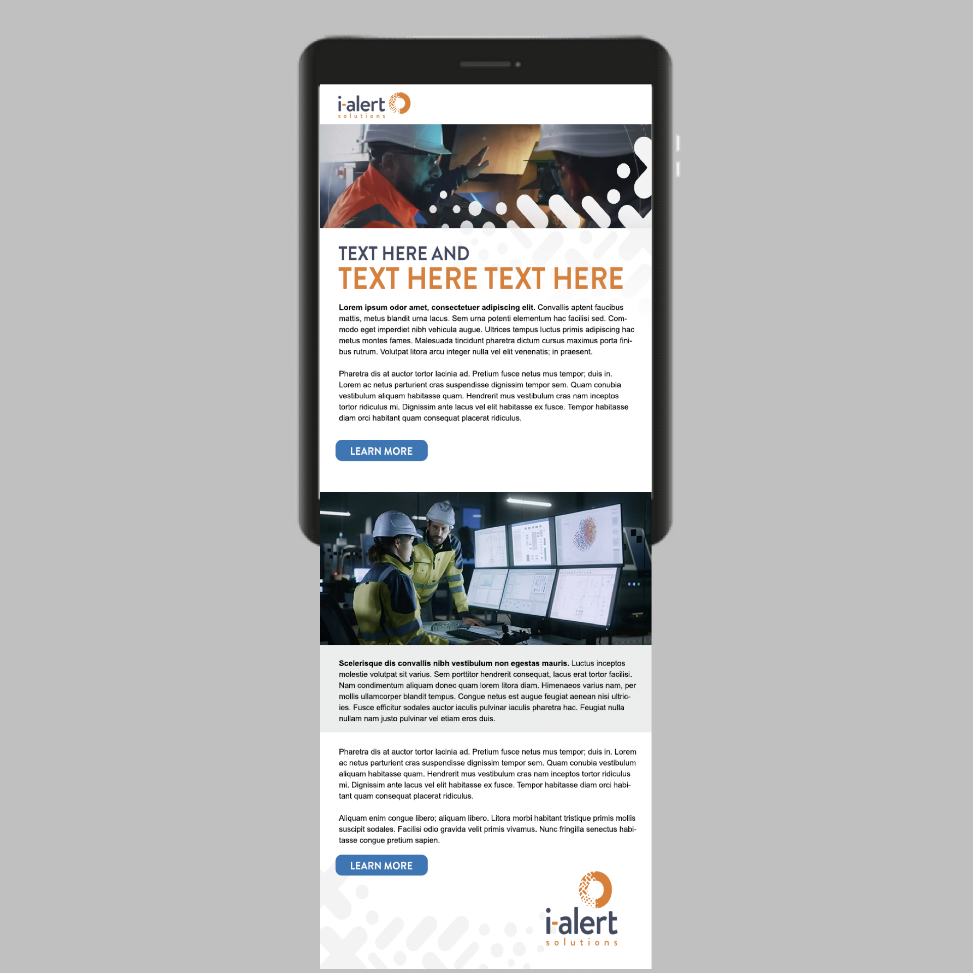
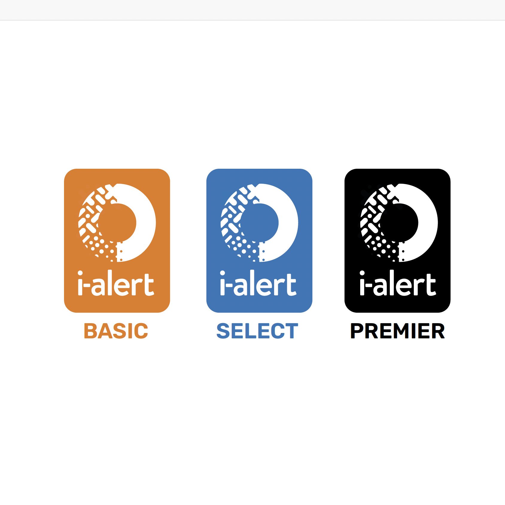
Built to support this new automated diagnostics offering, the identity positions i-ALERT as a best-in-class solution for real-time machine health. The circular logomark communicates the continuation of monitoring, with the shapes expressing the detection of fault types, severity, and recommended actions. The i-ALERT logotype connects with the mark in it’s rounded nature and approachable appearance, the hyphen linking between the two elements in color and form. The color palette was carried forth from the brands previous rendition, but now extended to add much greater depth and stature.
The result is a brand that clearly communicates its value: not just data, but decision-ready intelligence. And while some rebrands may chase headlines, this one sharpened the brand story helping to drive the sale of the entire business line.